Damascus
underground
Art direction / Branding
3D / UI/UX Design
This project was deep thinking about what is an underground, in the middle east, bilingual.
Which font to use, in both alphabet, how to compose with that. On top of that i had to think almost from scratch a underground in a city that don’t have any. Take references from the top subway signage system as New York, Paris, London, Moscow, Dubai, among many others. The result of this long study was this brand that use letter M which is the equivalent of the M in the latin alphabet. The letter mim in arabic have 3 shapes, the start one, the middle one and the end one. That is main concept that drive the all identity from the subway entrance that use both the Mim and the M letter in its shapes, to the way i transform the mim letters to a station or to a terminus or even to an indicator.
The three shapes
of the arabic letters Mim in a word


1. Initial Shape
1. Initial Shape
2. Nodal Shape
2. NODAL Shape

3. End/ALone Shape
3. End/ALone Shape

3. End/Alone Shape
3. End/Alone Shape

4. A Multi-
lingual logo
4. A Multi-
lingual logo
5. Colors
Color inspired by the city of Damascus

Color inspired by the city of Damascus


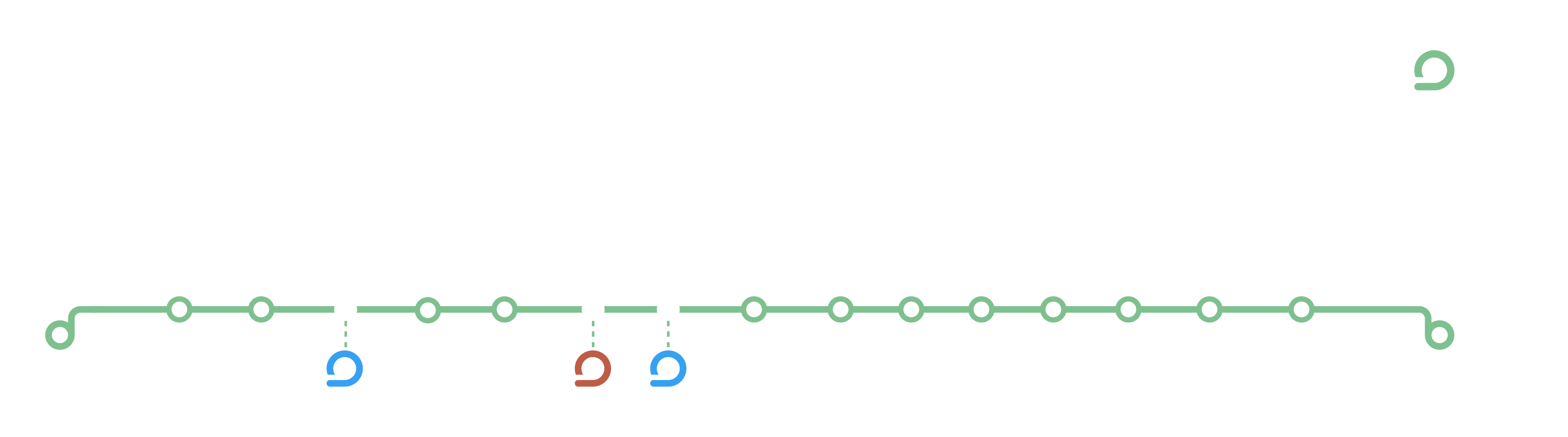
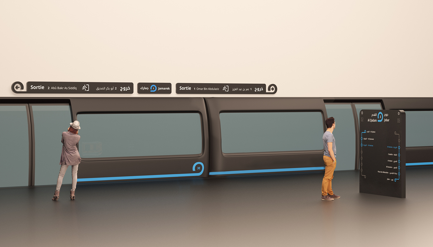
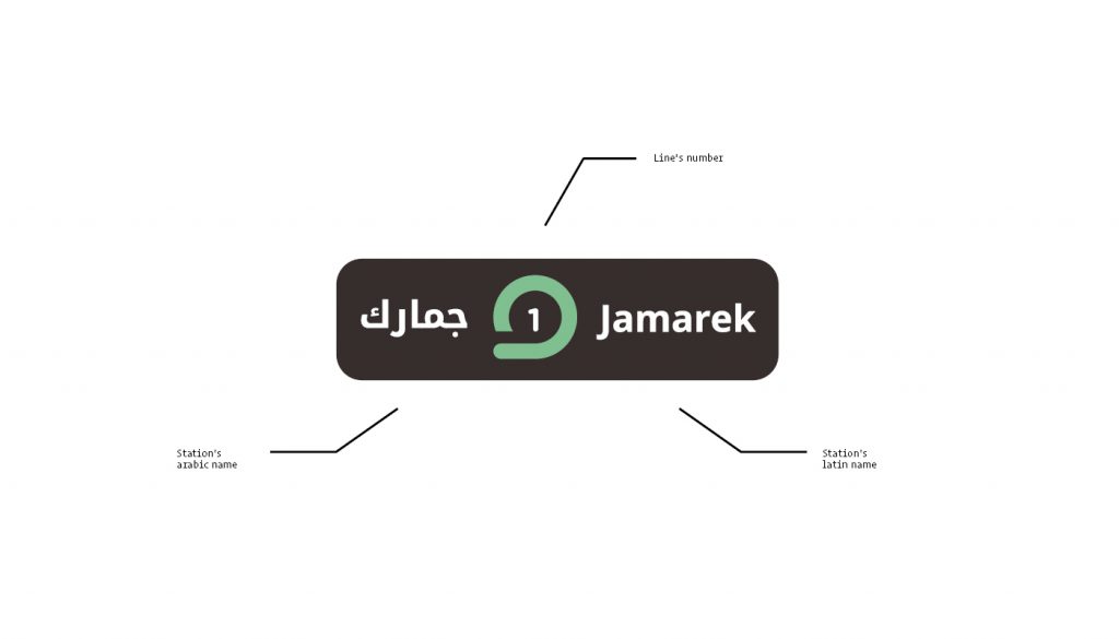
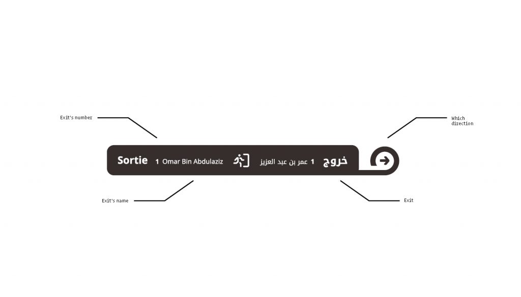
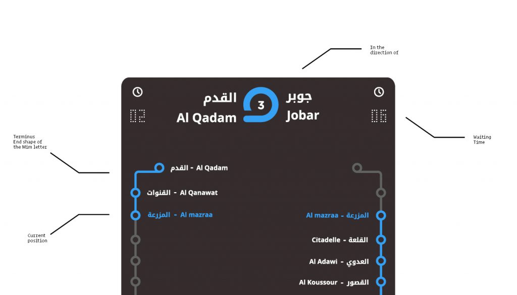
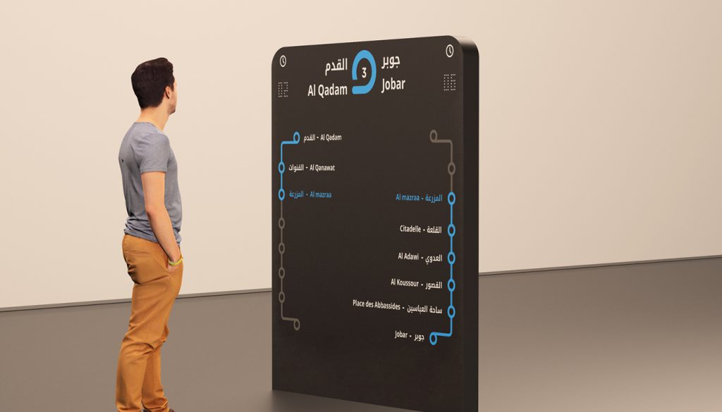
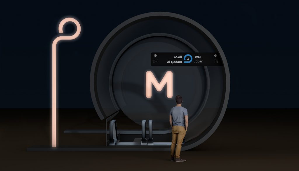
6. Signage System
6. Signage System
Designed to be read in both arabic and latin alphabet.
Station name, exit way, and current subways position in both way.
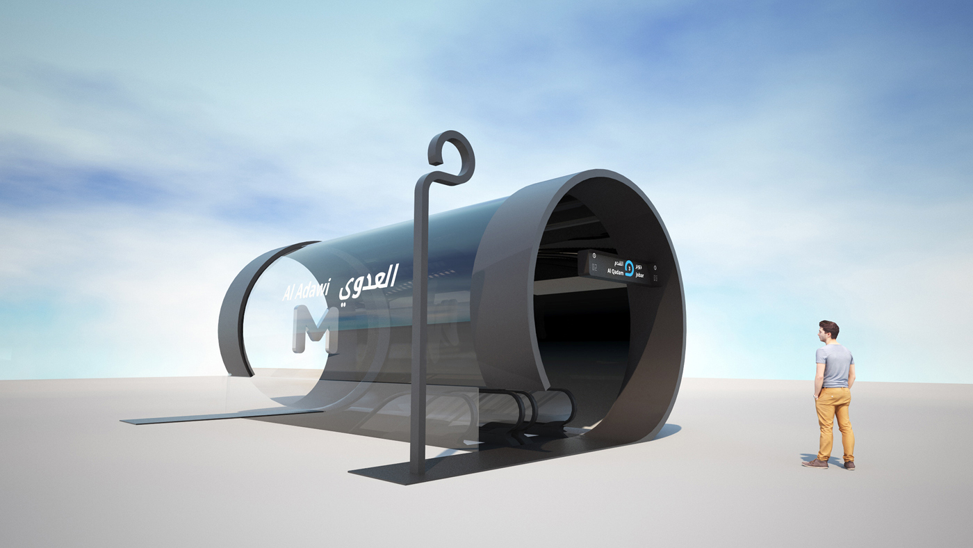
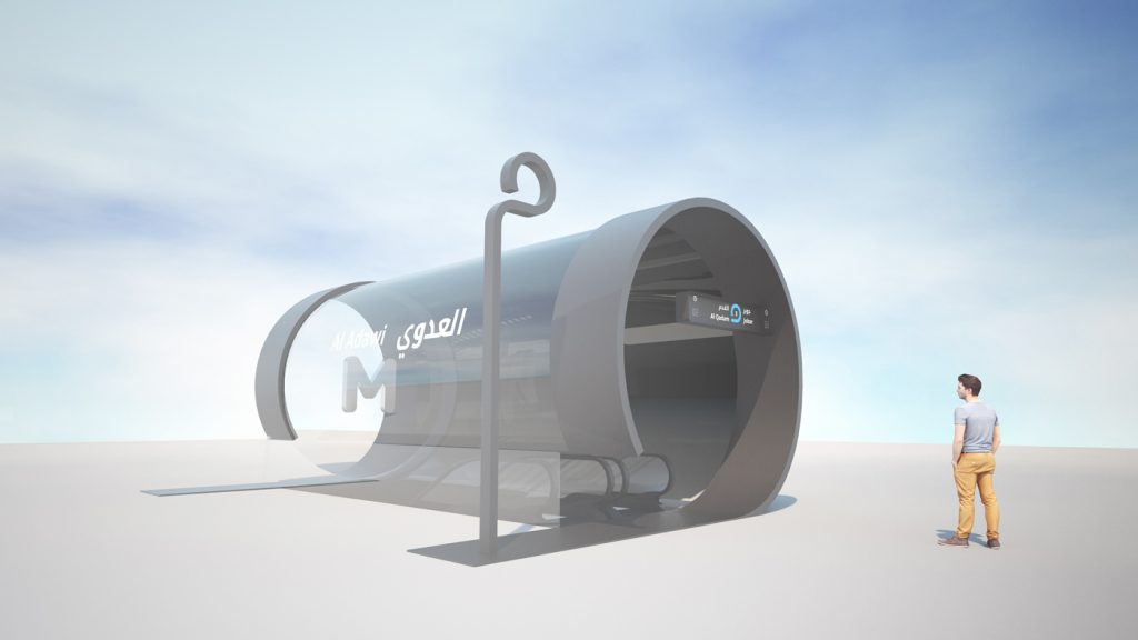
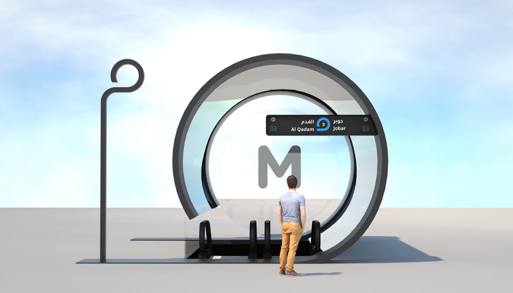
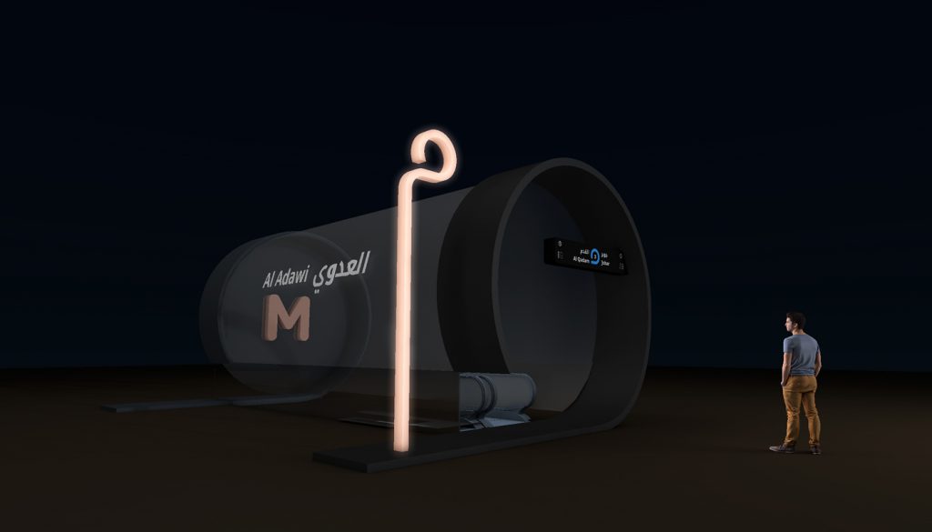
7. Subway entrance
7. Subway entrance
The subway entrace use the arabic letter Mim as well in its architecture.
The start shape is used for the main part, and the end/alone shape is used to indicate that this is an subway entrance from far.
It is also illuminated at night as well as the time indicator for the next subway in both way.
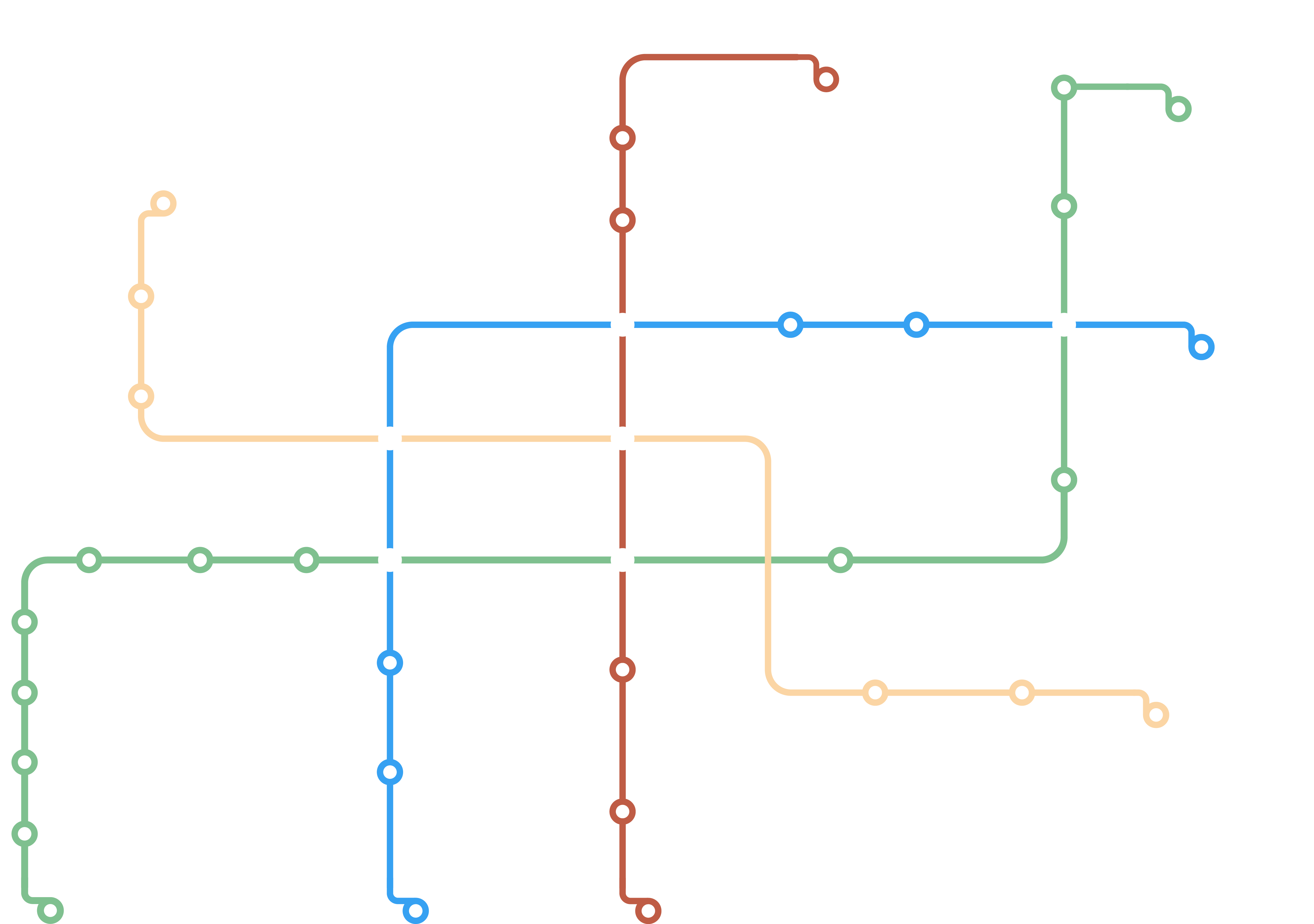
8. The Damascus Map
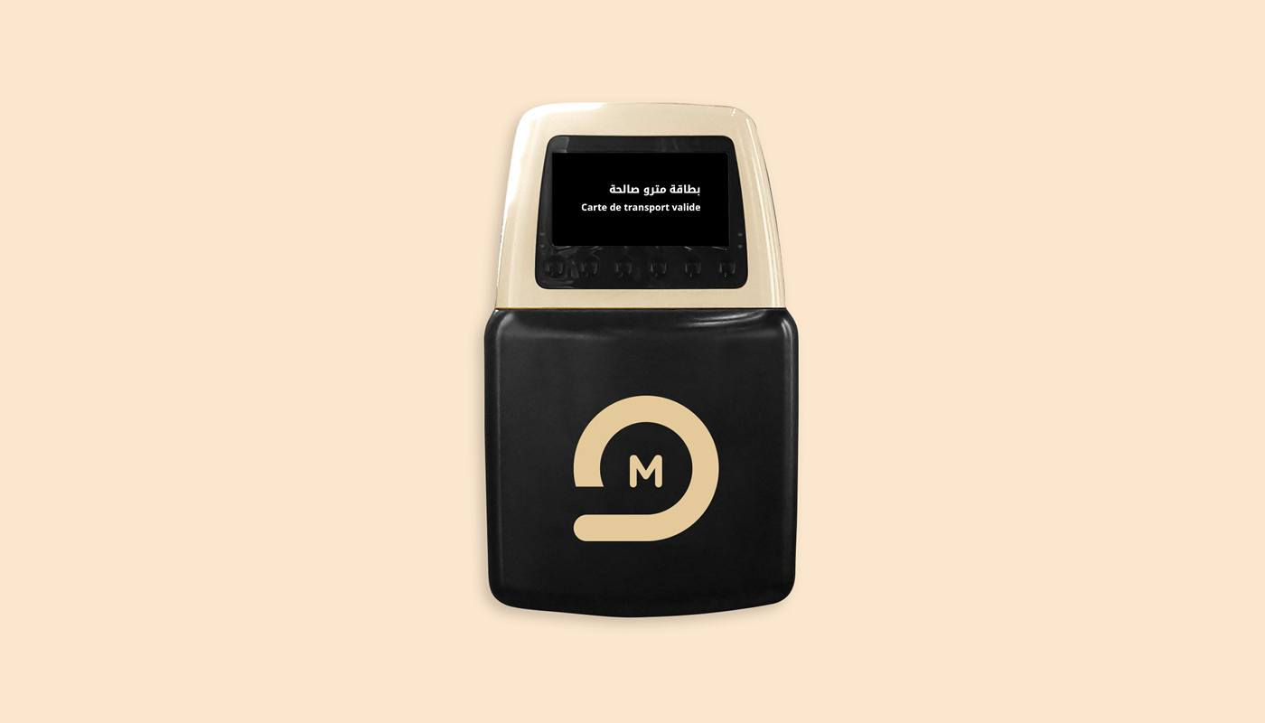
9. The ticket
9. The ticket
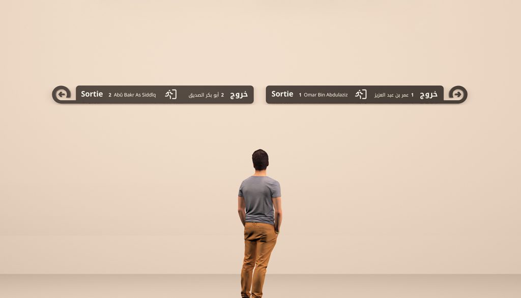
10. Icons
10. Icons
All icons of the damascus underground projet was designed
with the starting point of the exit icons made initially for the signage system.
All icons of the damascus underground projet was designed
with the starting point of the exit icons made initially for the signage system.
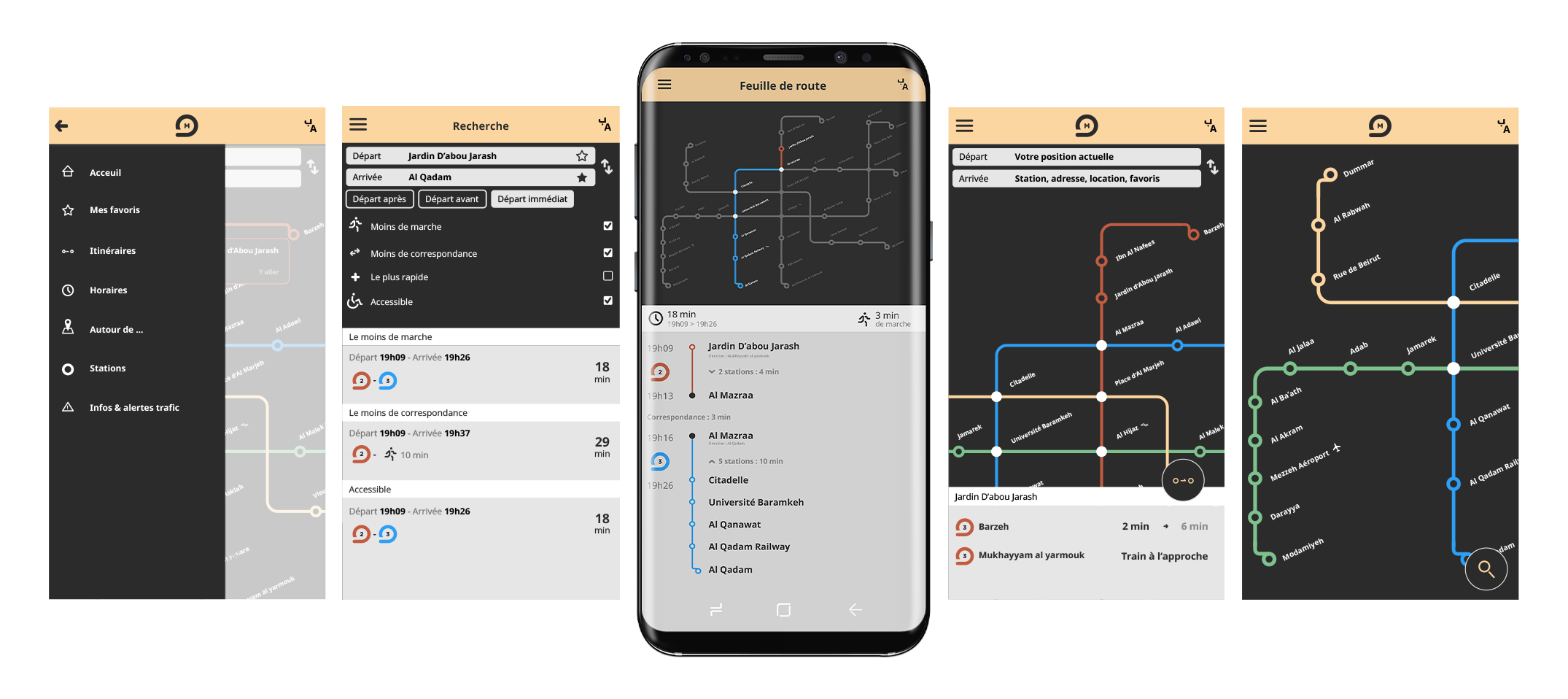
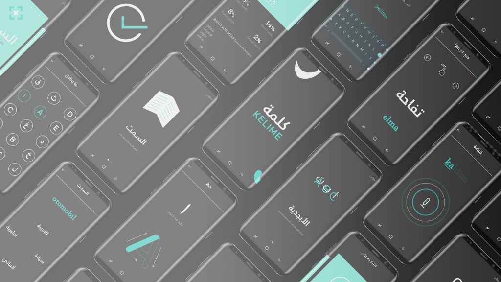
11. The Damascus Subway App
The mobile app help to find quickly his way in the subway system, by having favorite, quick selection
of destination by touching two stations or just knowing when are the next subway in both way in the selected station.

